A Smarter Way to Experience the Calilo Leeds New Website
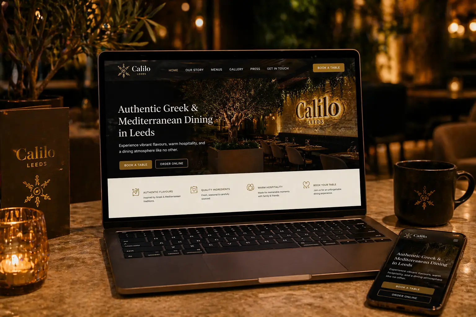
The Calilo Leeds new website has been designed to give guests a smoother, more enjoyable way to explore everything the restaurant offers. From browsing the menu to planning your visit, the new platform makes every step simple, clear, and accessible from any device.
This update reflects how people now interact with restaurants online. Before visiting, most guests want to explore dishes, understand the atmosphere, and make quick decisions. The new website has been built to support that journey from the very first click.
Whether you are visiting for the first time or returning, the experience now feels more intuitive, more visual, and far more aligned with what Calilo represents in person.
Designed for Simplicity and Speed
The Calilo Leeds new website focuses on clarity. Instead of overwhelming users with unnecessary content, the layout guides them through a natural flow. Visitors can easily explore the
<a href=”/menus”>menu</a>, browse the
<a href=”/gallery”>gallery</a>, or head straight to the
<a href=”/get-in-touch”>contact page</a> to make a booking.
Navigation has been simplified so users can find what they need quickly. This is especially important on mobile, where most restaurant searches now take place. According to
<a href=”https://www.thinkwithgoogle.com” target=”_blank”>Google research</a>, the majority of users expect fast and seamless mobile experiences when browsing restaurants.
By removing friction, the website allows users to move from interest to action without hesitation.
Showcasing Food the Right Way
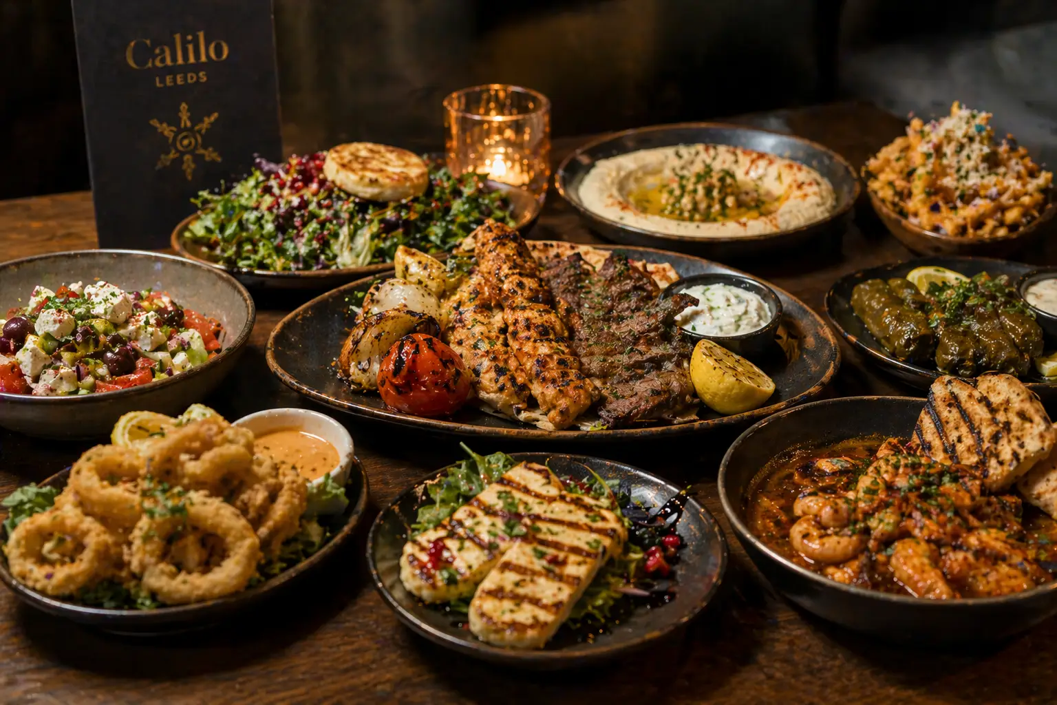
One of the biggest improvements within the Calilo Leeds new website is the visual presentation of food. High-quality imagery now plays a central role, helping users understand the quality, style, and variety of dishes before they even arrive.
Instead of relying on long descriptions, the website lets the food speak for itself. This approach reflects how modern users make decisions, where visuals often influence choices more than text.
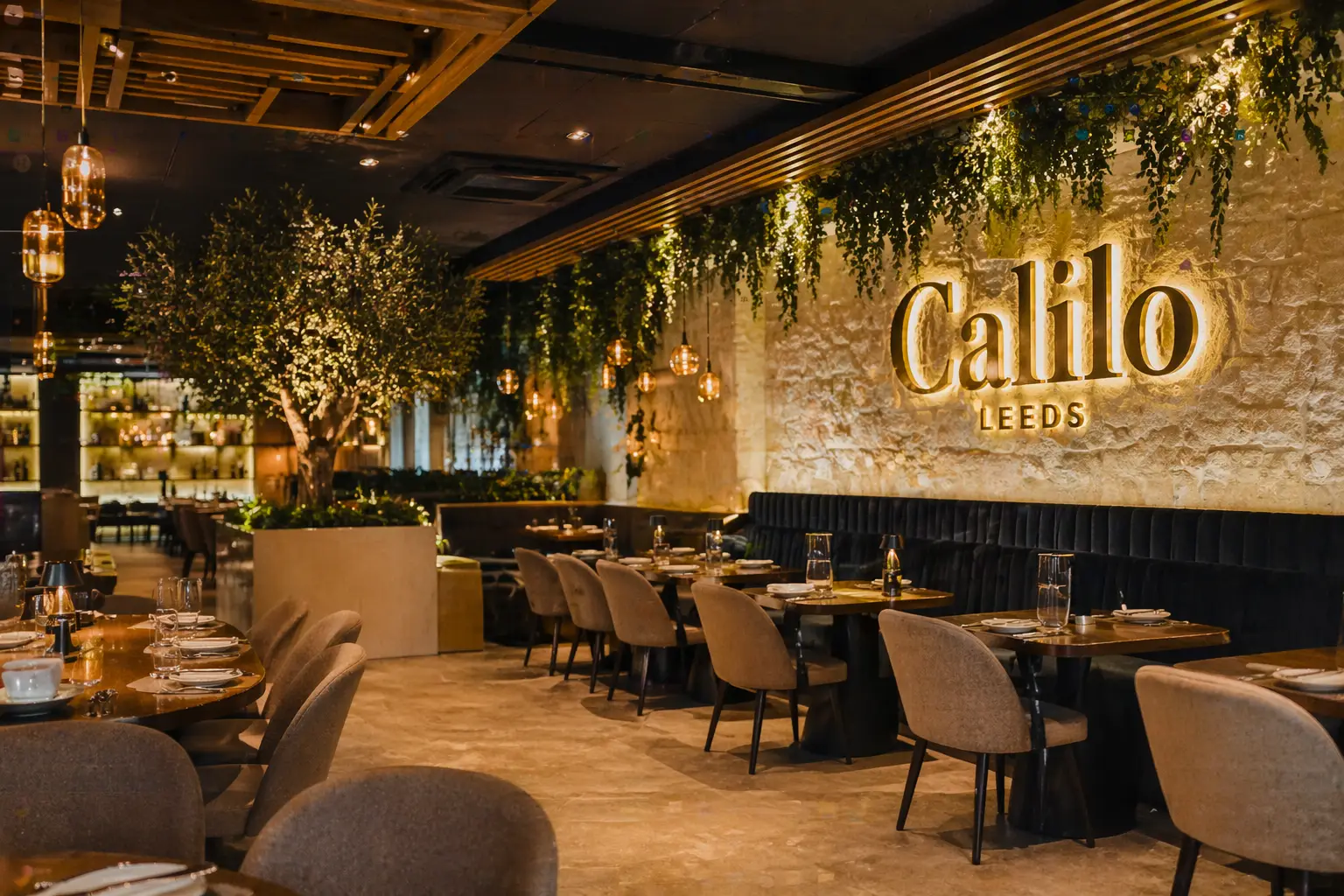
The updated structure also supports consistency across the brand. The same tone, colours, and style used inside the restaurant now carry through to the digital experience, creating a stronger and more recognisable identity.
Built for Action: Bookings and Orders Made Easy
A key goal of the Calilo Leeds new website was to make actions easier. Whether guests want to book a table or order online, the process now feels direct and effortless.
Clear calls to action guide users at the right moments, without interrupting the browsing experience. Visitors can quickly secure a table or explore ordering options without navigating through multiple pages.
For best practice in restaurant UX design, platforms like
<a href=”https://www.nngroup.com/articles/restaurant-websites/” target=”_blank”>Nielsen Norman Group</a> highlight the importance of clear booking paths and minimal steps. This principle has been applied throughout the new Calilo website.
A Website That Reflects the Brand
The Calilo Leeds new website is more than just a functional upgrade. It acts as a digital extension of the restaurant itself. The tone is warm, the design is refined, and the overall feel mirrors the in-person dining experience.
Every element has been considered to ensure consistency. From typography to imagery, the site presents Calilo as a modern, confident, and quality-driven restaurant.
This alignment is important. When a guest visits after exploring the website, the transition should feel natural. The new platform ensures that expectation and reality match.
Looking Ahead
The launch of the Calilo Leeds new website marks an important step forward. It strengthens the restaurant’s online presence while improving how customers interact with the brand.
As digital expectations continue to grow, having a website that performs well is no longer optional. It is essential. Calilo now has a platform that not only looks strong but also supports bookings, engagement, and long-term growth.
For guests, it means a better, faster, and more enjoyable experience. For Calilo, it represents a clear investment in both quality and the future.